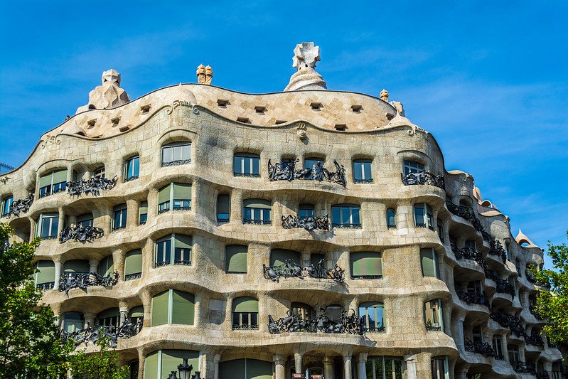
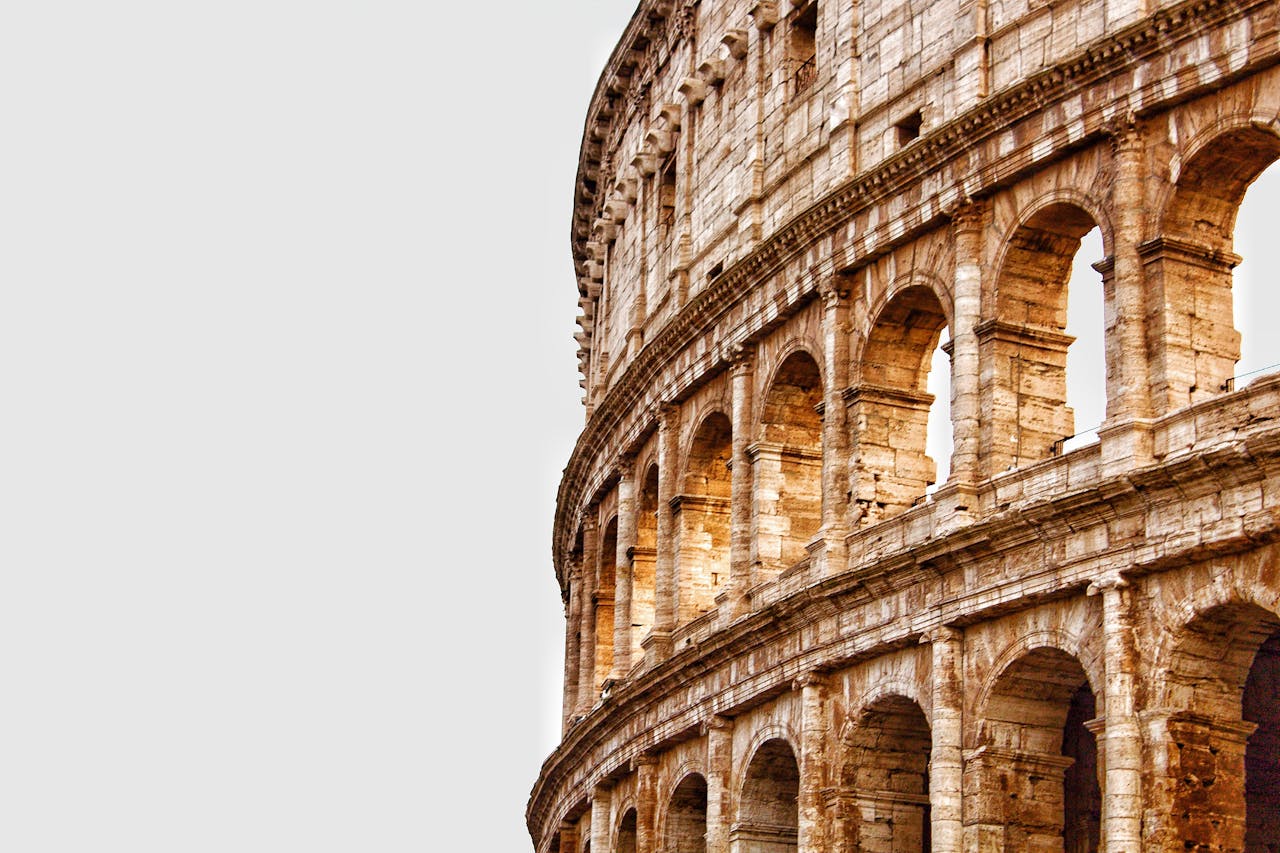
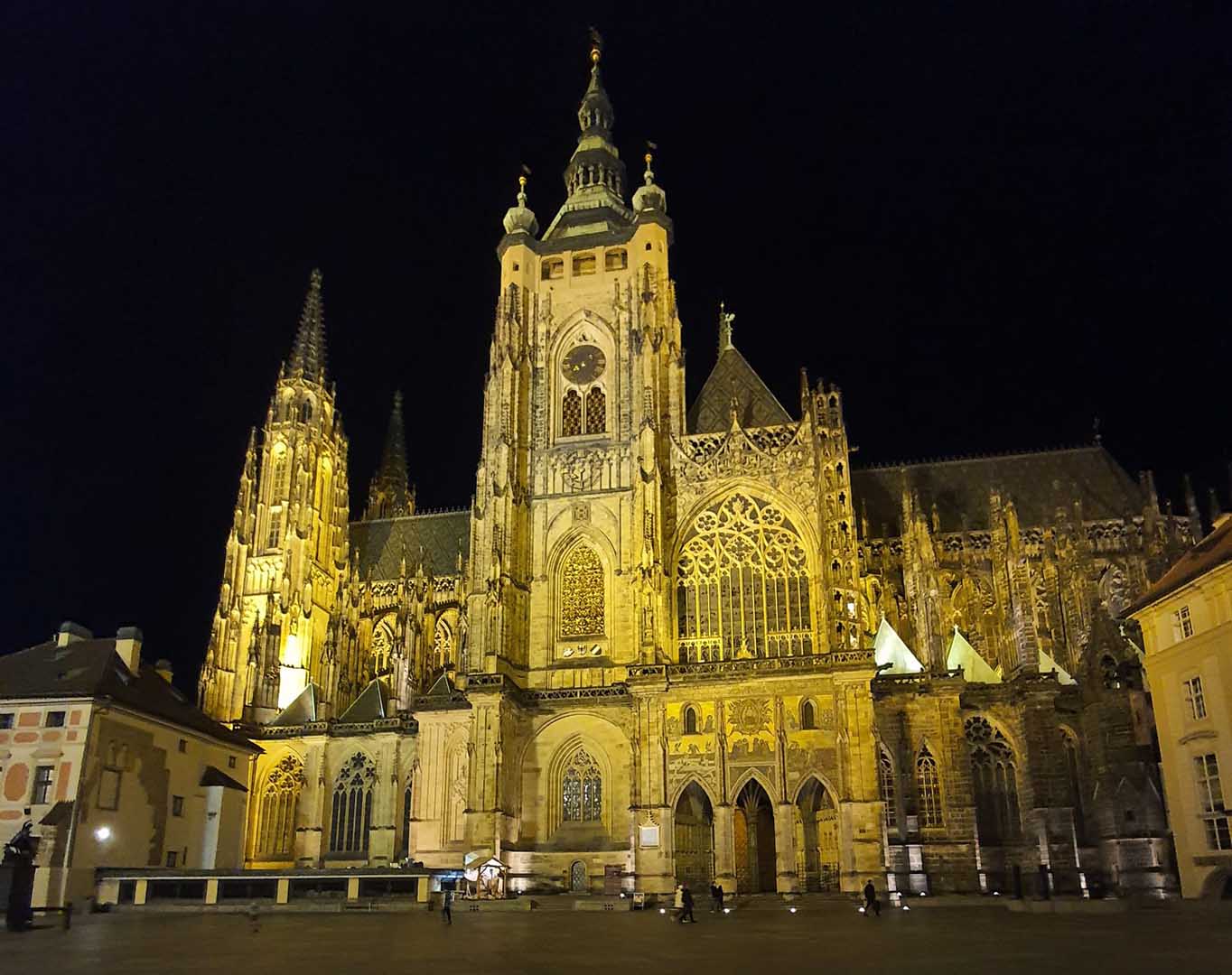
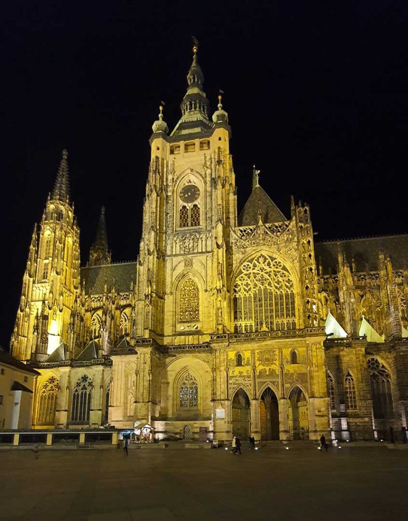
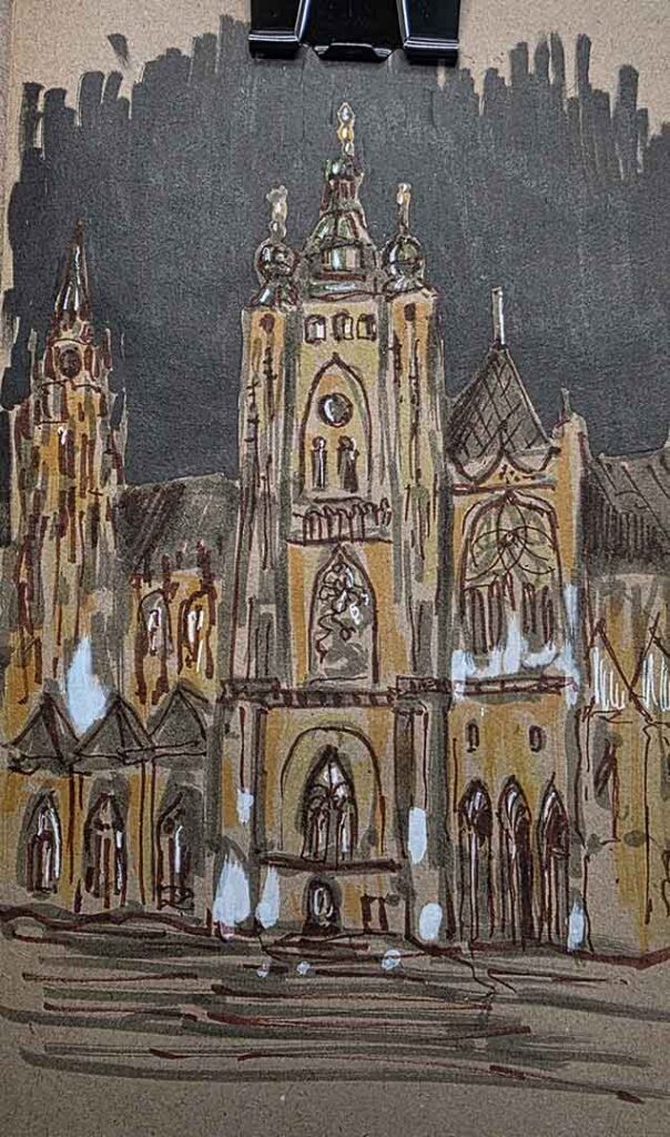
Sketching night scenes look complicated, but you can make them feel real with a simple plan and bold contrast. I sketched St. Vitus the Cathedral of Prague and the warm lights against the dark sky did all the storytelling for me. The trick is to build the structure first, then lock in the sky, then work from brightest highlights to deepest shadows. If you follow these five steps, you will get that glowing night atmosphere without overthinking every tiny detail.
Don’t miss my previous post there I make a sketch with acrylic markers in 5 simple steps. You can find it here.
See my acrylic markers set here.
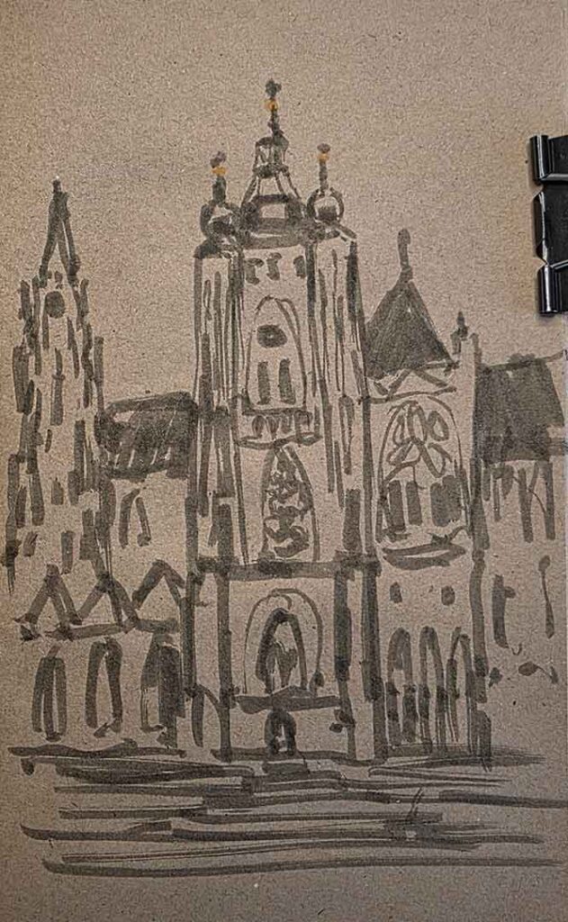
Line the Structure
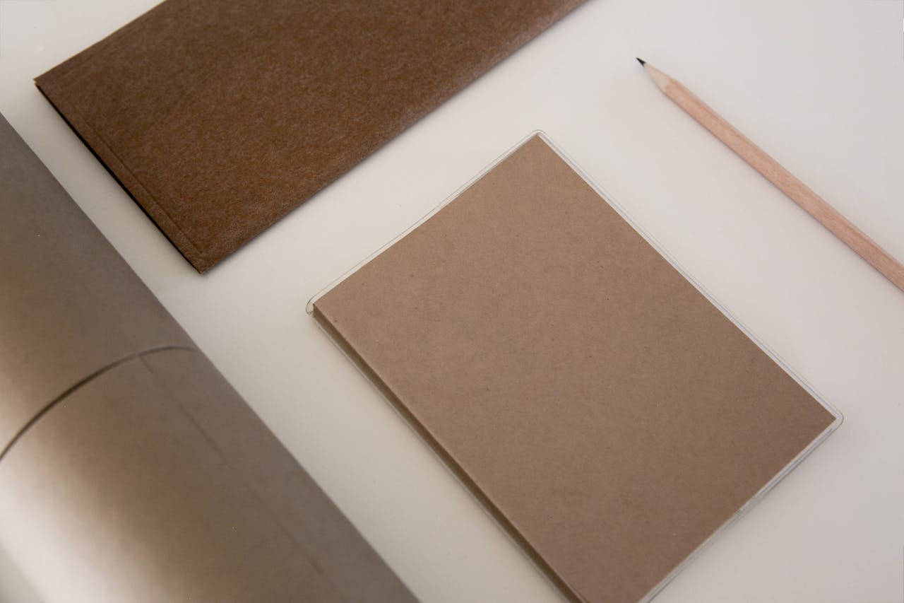
Start by choosing toned paper if you want instant night mood without fighting the white page.
I lightly sketched the cathedral structure and marked only the main shapes I wanted to capture, like towers, arches, and large windows. Keep your lines confident and simple, because this stage is your map, not the final drawing. When the structure feels solid, you will find it much easier to place light and shadow in the right spots later.
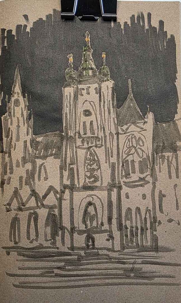
Color the Dark Sky
Now push the scene into nighttime by filling the sky with a black or other dark colored acrylic marker. Work around the building silhouette so the cathedral stays clean and readable against the background. This step creates maximum contrast, which is the secret weapon for any night sketch. I also added a touch of green on the cupolas to hint at the cooler tones you see in real night lighting.
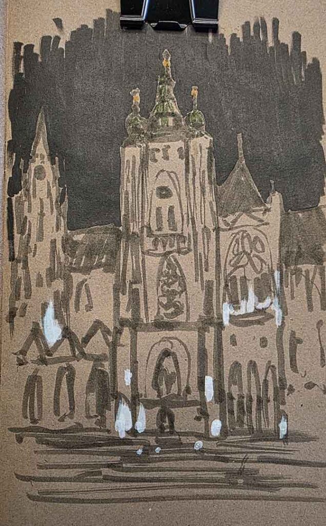
Add Highlights
Before you add warm colors, place your brightest light spots with a white acrylic marker. These highlight shapes act like little beacons that will guide the whole painting and keep the glow believable. Focus on the strongest light sources and reflections, not every window or ornament. When you do highlights first, you avoid muddy colors and you keep the night scene crisp and luminous.
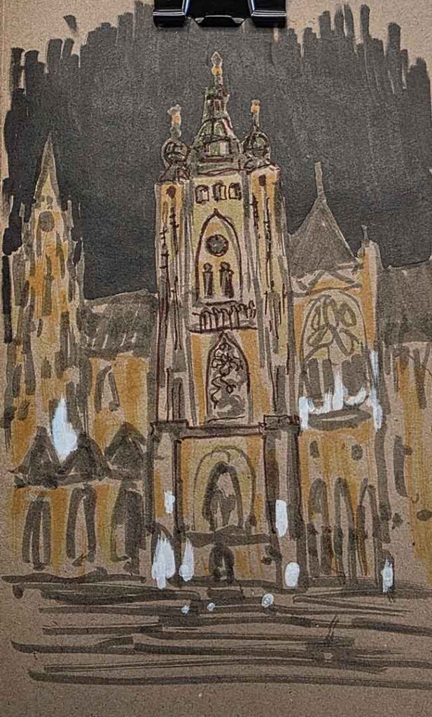
Add Lights
This is where the cathedral starts to shine. I added warm orange and cold yellow to mimic the street lighting and the glowing stone surfaces in the reference photo. Then I began lining important details with a brown brush pen, so the texture reads rich and gothic instead of harsh and cartoonish. Keep the warm colors on the lit planes, and let the toned paper and darker areas stay quiet so the light feels stronger.
Details
To finish, I lined the details that felt significant and strengthened the architecture with selective dark accents. Then I grounded the building and give the plaza that calm night depth. Finally, I dropped in a few small white highlights to bring back sparkle where the lights hit edges and ornaments. This last step is where the sketch becomes a story, not just a structure, so slow down and enjoy it.
Night sketching gets easier when you treat it like a sequence: structure, sky, highlights, lights, then shadows. Toned paper and acrylic markers make the process fast and forgiving, especially for travel sketches when you want results without a long setup. If you want to try this yourself, pick a landmark with strong lighting, and let contrast do the heavy lifting.