Lately I’ve been using White Nights quite often, and some of you already saw these colors appear in my sketches. I had a few pans before, but recently I received the full 24 color set as a gift. Since I already knew I loved this brand, I wanted to sit down, open everything slowly, test each color, and share my humble opinion with you. If you ever wondered whether this set is worth adding to your travel kit, I hope this helps you decide.
More sketches with White Nights see in my recent post.
Set like mine you can find here.
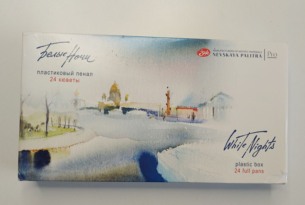
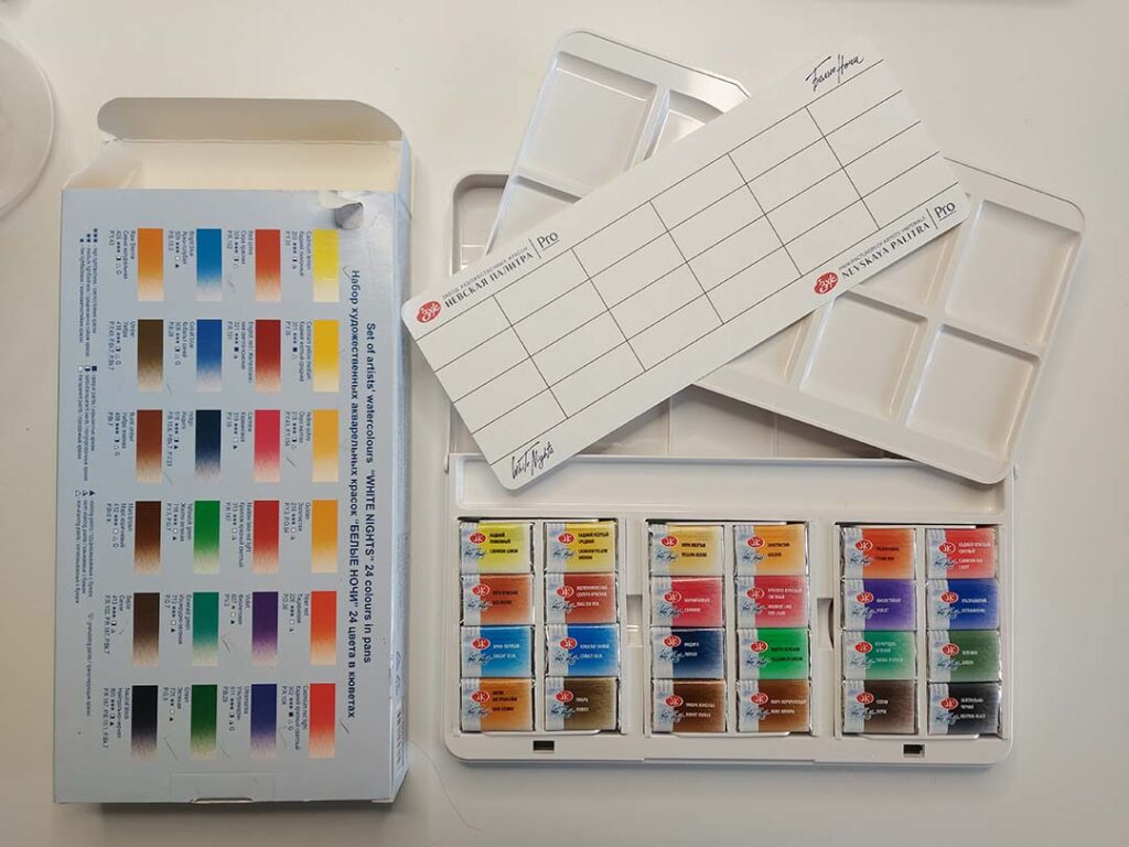
Package
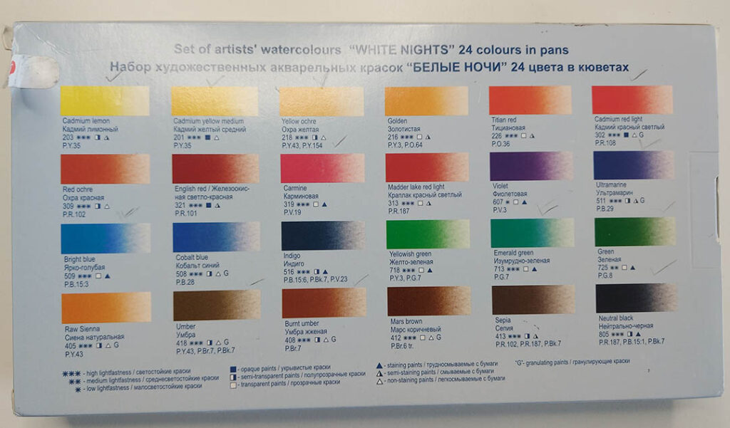
The set comes in a simple carton box with a surprisingly useful color chart printed right on the back. It includes pigment codes, transparency, staining, granulation, and lightfastness. I actually appreciate this more than fancy packaging, because it gives instant clarity on what you get. Inside you’ll find a small sheet for swatching and a plastic palette with two mixing trays. To be honest, the plastic case isn’t my favorite. Metal boxes feel sturdier and more professional, and the mixing surface behaves better with watercolor. But the pans themselves look like little candies wrapped in foil and paper, each labeled with full details. That part I really love.
About the Set
The selection of 24 colors feels balanced and practical for everyday sketching, especially if you enjoy travel scenes, landscapes, and architecture. Still, I would adjust a few things. I’d personally replace the cadmium lemon with a transparent lemon yellow to make mixing smoother. The violet has low lightfastness, which makes it less reliable if you care about archival quality. And instead of black, I would absolutely prefer Payne’s Grey, which is more useful for shadows and atmospheric effects. But overall, the palette has a lot of strong choices and it covers most sketching needs without adding extra pans.
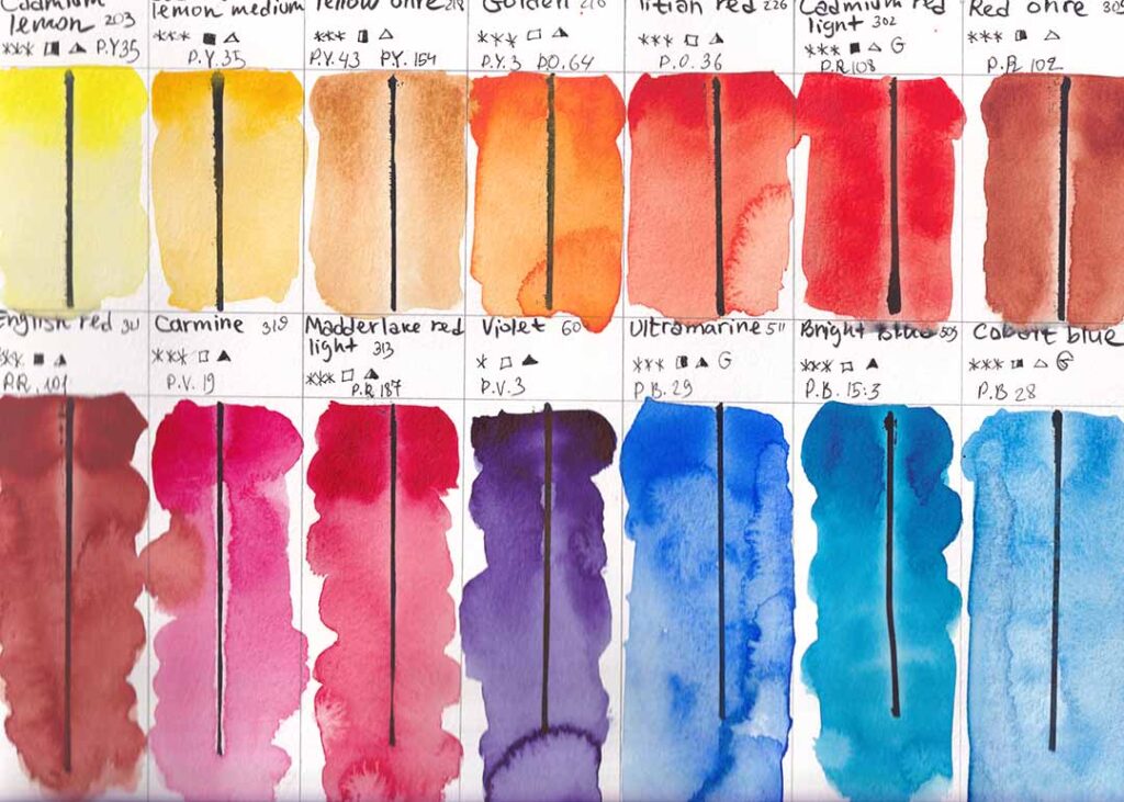
Colors Part 1
This is the first half of my swatches, all done on Canson cellulose paper. The pigments are vibrant, rich, and behave beautifully when wet. But the paper definitely affects the finish. I noticed some uneven drying and light staining, which doesn’t happen on 100% cotton. On proper cotton paper, these same colors settle smoothly and look more professional. Still, even on cellulose, you can feel their strength, especially in bright blues, reds, and warm yellows.
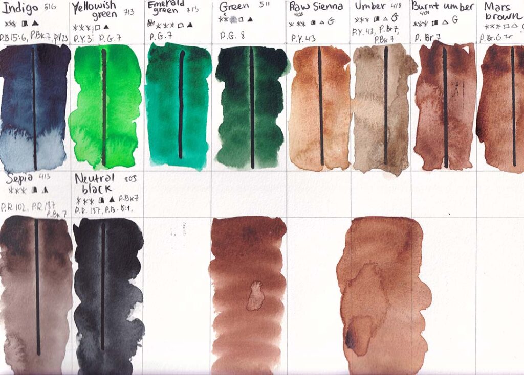
Colors Part 2
The second part of the swatches includes greens and earth tones. Burnt Umber and Mars Brown look very close at first glance, but Mars Brown granulates, creating interesting texture when you move the brush lightly. Again the cellulose paper caused some odd drying marks, so don’t judge the pigments by this alone. The greens are clean and expressive, especially Emerald and Green. Sepia and Neutral Black are powerful, but black still feels unnecessary in a set like this. With Payne’s Grey instead, this palette would be almost perfect.
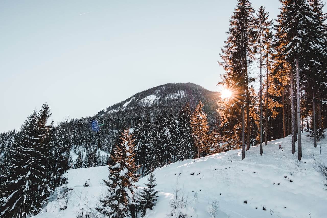
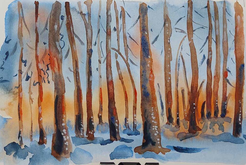
My Sketch
Here is a small winter forest sketch I painted using only this set. I used 100% cotton watercolor paper for this one, and the difference speaks for itself. The warm tones glow beautifully against the blues, and the pigments blend into each other with soft transitions. This shows the real potential of White Nights. When the paper is right, the colors behave exactly how you want them to expressive, bright, and perfect for fast travel sketches.
White Nights watercolors continue to impress me. For the intensity of their pigments, they are a fantastic option for everyday sketching and travel art. The set is not flawless, but it offers amazing value and performs best on good cotton paper. If you’re building your watercolor kit and want strong colors, this set is definitely worth considering. And as always, using materials you enjoy makes each sketching adventure even more rewarding.